Sapphire Blue Color: Meaning, Hex Code, Palettes and Design Ideas
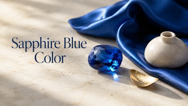
Sapphire blue is a rich, jewel-inspired shade that combines the calm character of blue with a polished, confident presence. This guide covers its most commonly used digital color code, meaning, complementary colors, shades, accessibility considerations and practical ideas for branding, web design, fashion, interiors and visual content.
Sapphire blue color has the depth of a gemstone and the clarity of a saturated modern blue. It is bold enough to become the focal point of a design, yet composed enough for professional branding, elegant interiors and formal fashion. That balance makes sapphire blue useful whenever a project needs to feel confident, polished and calm at the same time.
The most widely used digital reference for sapphire blue is #0F52BA. However, color names are not universal standards, and real sapphires range from pale blue to almost black. Treat #0F52BA as a practical starting point, then adjust its brightness and saturation to match your medium, lighting and visual style.
Sapphire Blue Color at a Glance
| Color value | Sapphire blue specification |
|---|---|
| HEX | #0F52BA |
| RGB | rgb(15, 82, 186) |
| RGB percentage | 5.9%, 32.2%, 72.9% |
| HSL | hsl(217, 85%, 39%) |
| HSV/HSB | 217°, 92%, 73% |
| CMYK approximation | 92%, 56%, 0%, 27% |
| Closest web-safe color | #0066CC |
For websites, apps and social graphics, use the HEX or RGB value. For print, begin with the CMYK approximation, but always request a physical proof. Deep blues can appear darker or less luminous on paper than they do on a backlit screen.
You can apply the color in CSS with this copy-ready code:
:root { --sapphire-blue: #0f52ba; --sapphire-deep: #0b3a84; --sapphire-light: #eaf1ff; } .sapphire-button { background-color: var(--sapphire-blue); color: #ffffff; }
What Does Sapphire Blue Look Like?
Sapphire blue sits between a bright primary blue and a dark navy. It is deeper and more jewel-like than many royal blues, but more vivid than traditional navy. Its relatively high saturation gives it energy, while its darker lightness keeps it controlled.
The color can change noticeably according to its surroundings. Against white, sapphire blue looks crisp and modern. Beside gold, brass or amber, it appears richer and more luxurious. When placed next to teal or indigo, it becomes part of a cool, atmospheric spectrum. Large areas of sapphire blue can feel dramatic, while small accents look precise and confident.
| Blue color | Common HEX reference | Main visual difference |
|---|---|---|
| Sapphire blue | #0F52BA | Deep, saturated and jewel-like |
| Royal blue | #4169E1 | Brighter and slightly softer |
| Cobalt blue | #0047AB | Darker with a stronger traditional blue character |
| Navy blue | #000080 | Much darker and more restrained |
| Azure | #007FFF | Lighter, clearer and more energetic |
These values are useful digital references rather than fixed definitions. Named colors often vary between paint manufacturers, fashion collections and design platforms.
Sapphire Blue Color Meaning and Symbolism
Sapphire blue commonly communicates trust, focus, loyalty, wisdom and refinement. The blue family already carries calm and dependable associations in many design contexts, while the gemstone connection adds a sense of rarity and quality.
Trust and Stability
Deep blues are frequently used in professional identities because they feel structured and reliable. Sapphire blue has enough brightness to feel more distinctive than navy without losing that stable character.
Clarity and Focus
The color can create a clean visual hierarchy, especially when used for headings, navigation or important interface elements. It draws attention without the urgency associated with red or bright orange.
Elegance and Quality
Because sapphire blue is linked visually with polished gemstones, it works naturally in premium packaging, jewelry campaigns, eveningwear and formal invitations. Pairing it with metallic gold or warm ivory strengthens this effect.
Calm Confidence
Sapphire blue feels assertive without being aggressive. It can give a layout or room a strong center while remaining quieter than neon or highly luminous blues.
Color meaning always depends on culture, context and surrounding elements. Typography, materials, imagery and contrast can make the same sapphire blue feel corporate, ceremonial, artistic or relaxed.
Colors That Go With Sapphire Blue
The best companion color depends on the mood you want. Warm hues create contrast, pale neutrals provide breathing room, and neighboring blues produce a smooth, immersive palette.
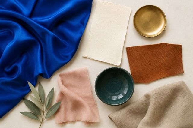
1. Sapphire Blue, Ivory and Gold
| Role | Color | HEX |
|---|---|---|
| Primary | Sapphire blue | #0F52BA |
| Background | Warm ivory | #FFF8E7 |
| Accent | Antique gold | #D4AF37 |
| Text | Charcoal | #252A34 |
This elegant palette works for wedding stationery, jewelry branding, beauty packaging and refined editorial layouts. Let ivory occupy most of the space, use sapphire blue for structure and reserve gold for small highlights.
2. Sapphire Blue and Burnt Orange
| Role | Color | HEX |
|---|---|---|
| Primary | Sapphire blue | #0F52BA |
| Accent | Burnt orange | #C65D24 |
| Neutral | Soft sand | #E8D8C4 |
| Dark anchor | Ink black | #1B1F2A |
Orange sits across from blue on the color wheel, so this pairing creates immediate energy. Burnt orange is usually easier to control than a bright pure orange. Use the two saturated colors in separate blocks rather than placing small text in one over the other.
3. Sapphire Blue, Teal and Midnight Navy
| Role | Color | HEX |
|---|---|---|
| Primary | Sapphire blue | #0F52BA |
| Secondary | Deep teal | #0B7A75 |
| Light neutral | Pale aqua | #CDEFF0 |
| Dark anchor | Midnight navy | #071E3D |
This analogous palette feels cohesive and atmospheric. It suits travel graphics, wellness branding, water-inspired visuals and cinematic night scenes. Vary the lightness of each blue-green shade so the elements do not merge together.
4. Sapphire Blue, Blush and Cream
| Role | Color | HEX |
|---|---|---|
| Primary | Sapphire blue | #0F52BA |
| Soft accent | Dusty blush | #E8B4B8 |
| Background | Cream | #FFF4E6 |
| Supporting tone | Lavender gray | #A49BCB |
Blush softens the formality of sapphire blue and gives the palette a more welcoming editorial character. This combination works well for lifestyle content, event design, fashion and personal brands.
5. Sapphire Blue, Sage and Taupe
| Role | Color | HEX |
|---|---|---|
| Primary | Sapphire blue | #0F52BA |
| Natural accent | Sage | #9CAF88 |
| Warm neutral | Taupe | #B8A99A |
| Background | Off-white | #F7F3EC |
Sage and taupe reduce the coolness of sapphire blue without creating sharp contrast. Use this grounded palette for interiors, sustainable packaging, hospitality and nature-oriented visuals.
6. Sapphire Blue for a Modern Interface
| Role | Color | HEX |
|---|---|---|
| Primary action | Sapphire blue | #0F52BA |
| Hover or highlight | Bright blue | #2A6FE8 |
| Selected background | Pale blue | #EAF1FF |
| Body text | Slate | #334155 |
| Main background | White | #FFFFFF |
This palette keeps the brand color recognizable across buttons, links, cards and selected states. Do not distinguish an error, success or active state by color alone; add text, an icon, a border or another visible cue.
Sapphire Blue Shades and Tints
A useful color system needs more than one HEX value. Darker shades create depth, while lighter tints support backgrounds and subtle interface states.
| Variation | HEX | Best use |
|---|---|---|
| Midnight sapphire | #061F4A | Dark backgrounds, packaging and dramatic interiors |
| Deep sapphire | #0B3A84 | Navigation, headers and formal branding |
| Classic sapphire | #0F52BA | Primary brand color, buttons and focal accents |
| Bright sapphire | #2A6FE8 | Links, highlights and energetic digital graphics |
| Soft sapphire | #8DB2F2 | Illustrations, charts and secondary accents |
| Pale sapphire | #D6E3FF | Cards, backgrounds and subtle selected states |
| Sapphire mist | #EAF1FF | Spacious page backgrounds and quiet UI areas |
For a coherent design system, assign each variation a role before using it. For example, keep classic sapphire for primary actions, deep sapphire for navigation and pale sapphire for selected backgrounds. Consistent roles make a palette easier to understand.
How to Use Sapphire Blue in Design
Branding and Packaging
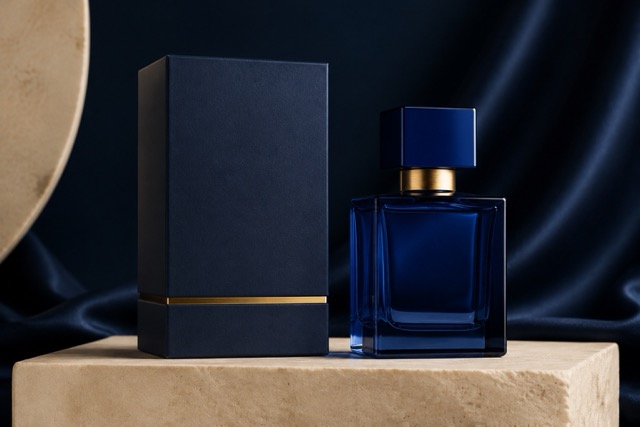
Sapphire blue can act as a recognizable anchor color for brands that want to appear established, focused or premium. Combine it with simple typography and generous negative space to prevent the identity from becoming visually heavy. On packaging, matte blue feels contemporary and understated, while a glossy finish or metallic foil creates a more formal look.
Websites and Apps
Use sapphire blue for primary buttons, links, navigation and important data points. Avoid filling every section with the same saturated blue; large white or pale-blue areas help users identify hierarchy. Define lighter and darker variants for hover, focus, selected and disabled states instead of changing colors inconsistently.
Photography and Video
Sapphire-blue clothing, props or backdrops provide strong color depth without disappearing like black. Warm skin tones, amber lights, wood and brass balance its cool temperature. When color grading video, preserve variation in dark blue areas so fabric, shadows and gradients do not collapse into one flat block.
Fashion and Events
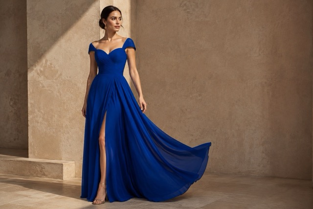
The shade works particularly well for eveningwear, formal accessories, wedding details and seasonal collections. Silver creates a cool, polished finish; gold makes the blue feel warmer and more ceremonial. For a softer daytime palette, combine it with cream, blush or pale gray.
Interior Design
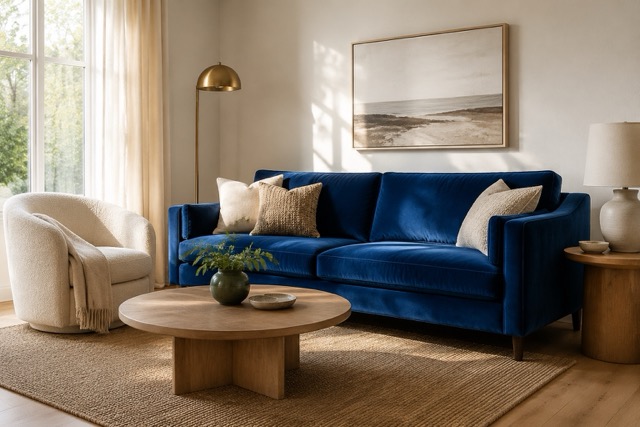
An accent wall, sofa, headboard or cabinetry in sapphire blue can give a room a clear focal point. Warm wood, woven textures, cream upholstery and brass lighting stop the space from feeling cold. If a permanent blue surface feels too strong, introduce the color through cushions, rugs, art or curtains.
Accessibility and Text Contrast
Color combinations that look attractive are not automatically readable. Under WCAG 2.2, normal text generally needs a contrast ratio of at least 4.5:1, while large text needs at least 3:1 for Level AA conformance.

| Combination | Approximate contrast | Practical result |
|---|---|---|
White #FFFFFF on sapphire #0F52BA | 7.15:1 | Passes AA for normal and large text; also reaches the 7:1 AAA threshold for normal text |
Ivory #FFF8E7 on sapphire #0F52BA | 6.75:1 | Passes AA for normal and large text |
Sapphire #0F52BA on pale blue #EAF1FF | 6.31:1 | Passes AA for normal and large text |
Black #000000 on sapphire #0F52BA | 2.94:1 | Fails AA for normal text and falls just below the large-text threshold |
Gold #D4AF37 on sapphire #0F52BA | 3.40:1 | Suitable only for large text under the basic ratio test, not normal body text |
White is therefore the clearest default text color on classic sapphire blue. Gold can remain an attractive decorative accent, but it should not carry small essential text. Test the final colors after accounting for gradients, transparency, images and different interaction states. The official WCAG 2.2 contrast guidance provides the full requirements.
Common Mistakes to Avoid
- Using too much saturated blue: Without neutral space, sapphire blue can make a design feel dense or visually tiring.
- Combining several equally strong jewel tones: Give one color the leading role and keep the others as controlled accents.
- Using black body text on sapphire: The contrast is too low for normal text. Choose white or a very light neutral.
- Assuming screen and print colors will match: Convert carefully, use the correct color profile and request a print proof.
- Relying on color alone: Status messages, selected controls and chart categories also need labels, icons, patterns or shapes.
- Ignoring material and lighting: The same HEX reference can look very different on glossy packaging, matte paint, fabric and illuminated screens.
Copy-Ready Sapphire Blue Image Prompts
These prompts can be adapted for an AI image generator, mood board or creative brief.
Luxury Product Photography
A premium perfume bottle on a rich sapphire blue pedestal, warm ivory background, delicate antique-gold details, soft directional studio lighting, realistic glass reflections, elegant editorial product photography, balanced negative space, high detail
Modern Interior
A refined contemporary living room with a sapphire blue velvet sofa, warm oak furniture, cream boucle chairs, brushed brass lighting, natural afternoon sunlight, calm upscale atmosphere, realistic interior photography, no visible text
Fashion Editorial
An editorial fashion portrait featuring a flowing sapphire blue evening dress, minimalist stone backdrop, soft warm spotlight, subtle gold accessories, realistic fabric texture, graceful movement, sophisticated magazine composition
Website Hero Background
A clean abstract website hero background in sapphire blue, deep navy and pale blue, layered translucent shapes, smooth controlled gradients, subtle depth, generous empty space for a headline, modern professional style, no text, 16:9
Wedding Tablescape
An elegant wedding table styled with sapphire blue linen, ivory flowers, clear crystal glassware and restrained gold accents, warm candlelight, romantic evening atmosphere, detailed editorial event photography, timeless composition
A Confident Blue That Still Feels Versatile
Sapphire blue color is powerful because it can lead a design without making it feel chaotic. The classic #0F52BA reference is deep enough for professional and formal settings, yet vivid enough for creative content, digital interfaces and statement interiors.
Start with a clear role for the color. Pair it with ivory and gold for elegance, burnt orange for energy, teal for atmosphere or sage for a grounded mood. Then test contrast, materials and output conditions before finalizing the palette. Used with restraint, sapphire blue can become a memorable visual signature rather than simply another shade of blue.
Frequently Asked Questions
What is the HEX code for sapphire blue?
The most commonly used digital HEX code for sapphire blue is #0F52BA. Because color names are not completely standardized, some platforms and manufacturers may use a slightly different value.
What RGB values create sapphire blue?
The RGB value for #0F52BA is rgb(15, 82, 186). Blue is the dominant channel, with a smaller amount of green and very little red.
Is sapphire blue a warm or cool color?
Sapphire blue is generally considered a cool color. Warm materials and accents such as gold, copper, burnt orange, cream and natural wood can make it feel more welcoming.
What color complements sapphire blue?
A warm orange is the strongest color-wheel complement. Burnt orange, copper and amber usually create a more refined pairing than bright pure orange. Ivory, cream, gray and taupe are easier neutral companions.
Is sapphire blue the same as royal blue?
No. Sapphire blue is usually deeper and more gemstone-like, while royal blue is commonly brighter and slightly lighter. Exact values can vary depending on the color system or manufacturer.
What text color works best on sapphire blue?
White is the most dependable choice on a #0F52BA background, with an approximate contrast ratio of 7.15:1. Black does not provide enough contrast for normal text on this shade.
Can sapphire blue be used as a brand color?
Yes. It can communicate focus, confidence and quality across logos, packaging and digital products. Build a complete system of light and dark variants so the color remains useful across backgrounds, text, buttons and interface states.