18 Mountain Color Palette Ideas with HEX Codes and AI Prompts
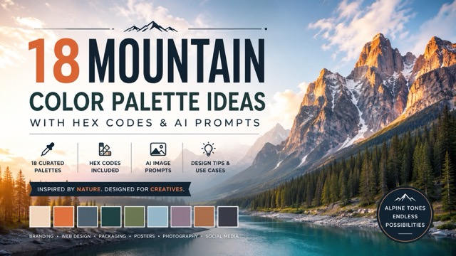
Discover mountain-inspired color combinations, practical design tips, and ready-to-use AI prompts for branding, websites, packaging, and social media visuals.
Introduction
Mountain landscapes offer much more than dramatic scenery. Snow-covered peaks, pine forests, rocky cliffs, alpine lakes, foggy valleys, and glowing sunsets create natural color combinations that can inspire branding, websites, packaging, posters, photography, and social media content.
A well-designed mountain color palette usually combines dependable neutral colors with one or two expressive accents. Stone gray provides structure, forest green adds depth, snow white creates breathing room, while sunrise orange or glacier blue introduces energy.
In this guide, you will find 18 mountain-inspired color palettes with HEX codes, moods, design applications, and copy-ready AI prompts. You can also explore more visual styles and prompt ideas through the Pixomi Banana Prompts library when you need inspiration for your next AI-generated image.
Why Mountain Color Palettes Work So Well
Mountain-inspired colors feel balanced because they naturally combine warm and cool tones.
Rock, soil, bark, and dry grass introduce earthy browns, soft beige, amber, and terracotta. Snow, ice, mist, lakes, and distant skies provide white, pale blue, slate, teal, and cool gray. These contrasting color families create visual depth without making a design feel chaotic.
Mountain palettes are also versatile. They can feel:
- Peaceful and minimal
- Rugged and adventurous
- Warm and nostalgic
- Premium and sophisticated
- Dark and cinematic
- Fresh and environmentally conscious
The key is to assign each color a clear role. Use the lightest shade for backgrounds, the darkest shade for text, a middle tone for supporting elements, and the brightest color for buttons, icons, labels, or important details.
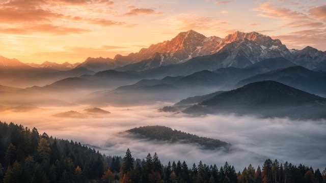
1. Morning Peak Color Palette
HEX Codes: #FFF7E8 #F5C58E #D97A50 #6D7C86 #28363D
Mood: Warm, peaceful, optimistic
Best for: Travel websites, hotel branding, tour advertisements
This palette captures the first light appearing behind a quiet mountain ridge. Soft cream and warm peach create an inviting foundation, while burnt orange adds energy. Slate blue and deep charcoal keep the overall composition grounded.
Use the cream shade as the primary background, slate for supporting sections, and orange for calls to action. This combination works especially well for travel brands that want to appear adventurous without looking overly intense.
AI Image Prompt:
A cinematic sunrise over layered mountain ridges, soft morning mist filling the valley, warm sunlight touching the highest peaks, color palette using #FFF7E8, #F5C58E, #D97A50, #6D7C86, and #28363D, atmospheric landscape photography, realistic natural lighting, subtle depth, peaceful travel editorial aesthetic, highly detailed, 16:9 composition
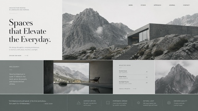
2. Silent Granite Color Palette
HEX Codes: #F4F5F3 #C8CCCA #8B9290 #4D5554 #202625
Mood: Minimal, stable, professional
Best for: Architecture portfolios, dashboards, business presentations
Silent Granite is built around cool gray tones inspired by exposed rock and overcast mountain skies. It creates a clean, dependable appearance that allows typography, photographs, charts, and interface elements to remain the focus.
Use the lightest gray for page backgrounds, the middle shades for cards and dividers, and the darkest color for navigation and body text. A separate accent color can be added for buttons, but it should be used sparingly.
AI Image Prompt:
Minimalist architecture portfolio website inspired by granite mountains, clean editorial grid, large image panels, refined typography, neutral interface using #F4F5F3, #C8CCCA, #8B9290, #4D5554, and #202625, spacious layout, premium modern design, no device frame, 16:9
3. Deep Pine Trail Color Palette
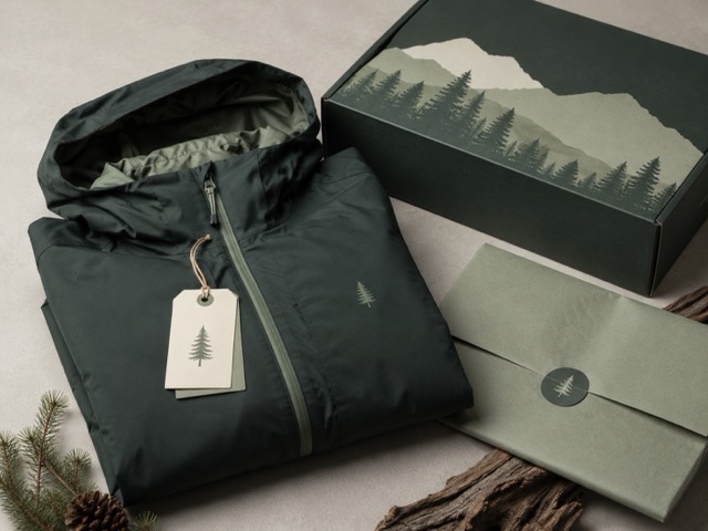
HEX Codes: #EDF0E5 #A7B29B #536B50 #294236 #10251D
Mood: Natural, grounded, mature
Best for: Outdoor clothing, camping products, eco-friendly brands
Deep Pine Trail combines moss, pine needles, shaded leaves, and dark forest soil. The palette feels strong and authentic, making it suitable for outdoor products and brands connected to nature.
Use the pale green-gray as the background and reserve the darkest forest shade for logos, headings, and packaging details. Natural paper, canvas, wood, and matte textures will make this combination feel even more believable.
AI Image Prompt:
Premium outdoor clothing packaging displayed in a clean studio, folded hiking jacket with matte paper tags, forest-inspired branding using #EDF0E5, #A7B29B, #536B50, #294236, and #10251D, natural materials, soft directional lighting, realistic product photography, rugged but refined aesthetic, 4:3
4. Frozen Lake Color Palette
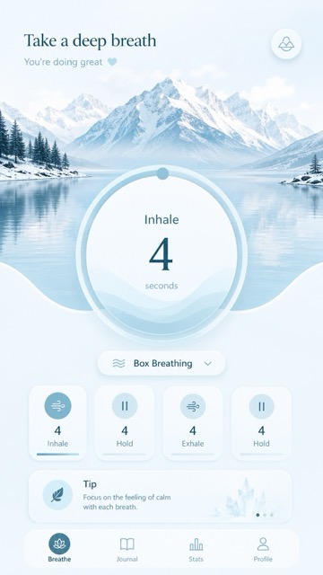
HEX Codes: #F8FCFF #D9EDF4 #A4CFDB #568A9B #203F4A
Mood: Clean, calm, refreshing
Best for: Wellness apps, skincare, medical platforms, spa branding
Inspired by frozen alpine water and pale winter skies, this mountain color palette communicates clarity and calm. Light blue shades make interfaces feel open, while dark teal provides readable contrast.
Use white and pale blue across large background areas. The middle blue can be used for buttons, progress indicators, or icons, while deep teal is ideal for headlines and important information.
AI Image Prompt:
Calm wellness mobile app interface inspired by a frozen alpine lake, soft rounded cards, breathing exercise screen, clean layout using #F8FCFF, #D9EDF4, #A4CFDB, #568A9B, and #203F4A, gentle gradients, modern minimal UI, no phone frame, 9:16
5. Alpine Wildflower Color Palette
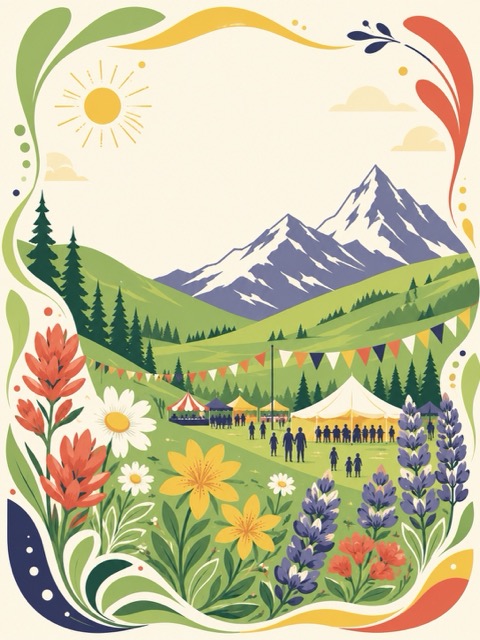
HEX Codes: #FAF6E9 #91B86E #F1C75B #D66B55 #454568
Mood: Cheerful, lively, welcoming
Best for: Festival posters, farmers markets, community events
This colorful palette reflects a mountain meadow filled with green grass, yellow flowers, red-orange petals, and distant blue shadows. It feels playful without becoming excessively bright.
Use the creamy shade as the base. Green and yellow can support illustrations, while terracotta works well for promotional details. The muted navy provides enough contrast for headings and dates.
AI Image Prompt:
Bright spring mountain festival poster, stylized hills, alpine wildflowers and flowing organic shapes, cream background, color palette using #FAF6E9, #91B86E, #F1C75B, #D66B55, and #454568, clean vector illustration, cheerful community event design, balanced typography areas, no photos, 3:4
6. Red Canyon Evening Color Palette
HEX Codes: #252A38 #697487 #F3E9DE #D87759 #F1A35E
Mood: Dramatic, warm, cinematic
Best for: Beverage campaigns, lifestyle advertisements, event graphics
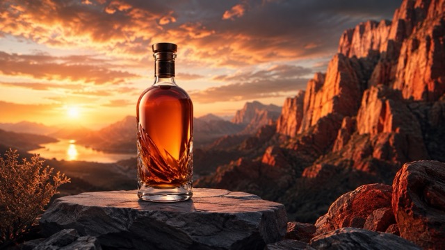
Red Canyon Evening combines dark mountain shadows with warm sunset colors. Navy and cool gray create visual tension against coral and amber, helping products or promotional messages attract attention.
Use the darker shades for the main background and place warm colors around the central product or message. The light neutral tone can separate text from darker areas.
AI Image Prompt:
Cinematic beverage advertising scene inspired by a red mountain canyon at sunset, premium glass bottle on a stone platform, dramatic lighting using #252A38, #697487, #F3E9DE, #D87759, and #F1A35E, warm glowing highlights, deep shadows, realistic commercial photography, 16:9
7. Snow and Stone Color Palette
HEX Codes: #FCFBF7 #E8E4DC #BDB8AF #77736E #302F2D
Mood: Refined, timeless, quiet
Best for: Editorial layouts, fashion portfolios, luxury websites
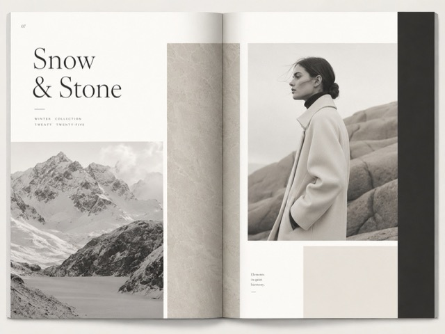
Snow and Stone offers a softer alternative to pure black and white. Its warm gray tones feel more natural and comfortable while maintaining a premium minimalist appearance.
This palette works best when photography or typography needs to remain dominant. Use off-white across most of the layout, warm gray for captions, and charcoal for headings.
AI Image Prompt:
Luxury editorial magazine spread inspired by snow-covered mountains and smooth stone, refined serif typography, spacious grid, monochrome fashion image placeholders, color palette using #FCFBF7, #E8E4DC, #BDB8AF, #77736E, and #302F2D, minimalist print design, 4:3
8. Alpine Lake Spruce Color Palette
HEX Codes: #EAF4F1 #8FB8AE #397C70 #214A44 #102824
Mood: Dependable, cool, outdoorsy
Best for: Sustainability reports, corporate presentations, environmental brands
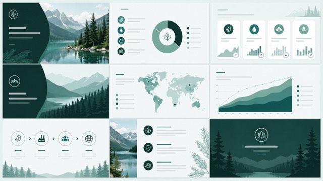
Alpine Lake Spruce combines clear green water with evergreen forest tones. It communicates environmental responsibility without relying on overly bright green.
Use pale mint as a presentation or website background. Medium teal can highlight charts and section headings, while dark green works for important statistics and navigation.
AI Image Prompt:
Professional sustainability presentation template inspired by alpine lakes and spruce forests, clean charts, environmental data cards and section dividers, colors #EAF4F1, #8FB8AE, #397C70, #214A44, and #102824, modern corporate design, flat vector details, 16:9
9. Mountain Cabin Color Palette
HEX Codes: #F4E7D2 #C8A476 #8D6845 #594536 #29231F
Mood: Rustic, comfortable, nostalgic
Best for: Coffee packaging, restaurants, handmade products
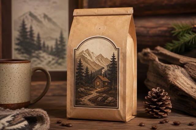
Mountain Cabin is inspired by weathered wood, leather furniture, kraft paper, and warm drinks after a long hike. Its earthy shades feel familiar and handmade.
Use the lighter tan shades for packaging surfaces. Dark brown works well for logos and typography, while the medium tones can support illustrations, borders, and labels.
AI Image Prompt:
Artisan coffee packaging inspired by a cozy mountain cabin, kraft paper bag with vintage illustrated label, wood and trail motifs, color palette using #F4E7D2, #C8A476, #8D6845, #594536, and #29231F, realistic studio product photography, tactile print texture, 3:2
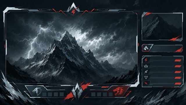
10. Storm Warning Color Palette
HEX Codes: #EEF1F3 #9BA9B2 #4C5C66 #202B31 #C14E43
Mood: Powerful, intense, high-contrast
Best for: Gaming graphics, sports branding, technology interfaces
Storm Warning is dominated by steel gray and dark charcoal, with a controlled red accent. The red should appear only in areas that require immediate attention, such as notifications, active buttons, scores, or status labels.
Using too much red can weaken the effect. Let the neutral shades control most of the composition and use the accent as a visual signal.
AI Image Prompt:
Modern esports livestream overlay inspired by a mountain storm, sharp interface panels, dramatic dark background, color palette using #EEF1F3, #9BA9B2, #4C5C66, #202B31, with controlled accent #C14E43, energetic angular layout, high contrast, no device frame, 16:9
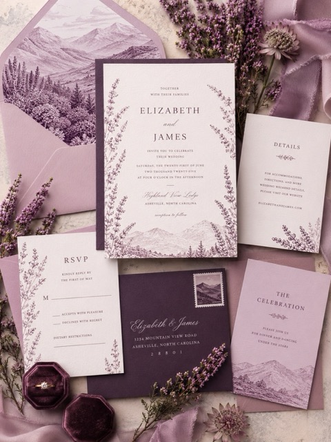
11. Heather Valley Color Palette
HEX Codes: #FBF4F8 #DEBED0 #AD819E #674E69 #302636
Mood: Romantic, dreamy, atmospheric
Best for: Wedding invitations, beauty brands, stationery
Heather Valley transforms soft mountain flowers and purple evening haze into an elegant romantic combination. It provides warmth without depending on conventional bright pink.
Use pale blush as the main background, mauve for decorative illustrations, and plum for names or important headings. Thin line drawings and delicate serif typography complement this palette.
AI Image Prompt:
Elegant mountain wedding invitation suite inspired by heather-covered valleys, delicate botanical line art and refined typography, colors #FBF4F8, #DEBED0, #AD819E, #674E69, and #302636, clean light background, romantic premium stationery design, no hands, 3:4
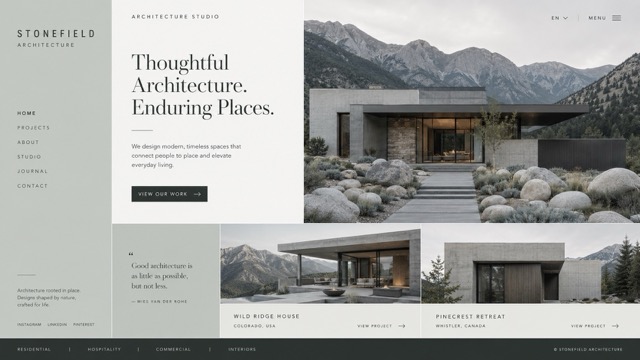
12. River Pebble Color Palette
HEX Codes: #F5F6F2 #D2D7D1 #9FA7A0 #626A64 #303632
Mood: Balanced, calm, disciplined
Best for: Interior design, architecture websites, portfolios
This understated mountain color palette is based on river pebbles, pale silt, moss, and shaded stone. It creates a professional appearance without feeling cold or industrial.
Use the two lightest shades for large surfaces. The medium gray-green works well for borders and secondary text, while the darkest shade provides readable body copy.
AI Image Prompt:
Minimal architecture studio website homepage inspired by smooth river stones in a mountain valley, structured editorial grid, large project images and clean typography, color palette using #F5F6F2, #D2D7D1, #9FA7A0, #626A64, and #303632, premium modern design, 16:9
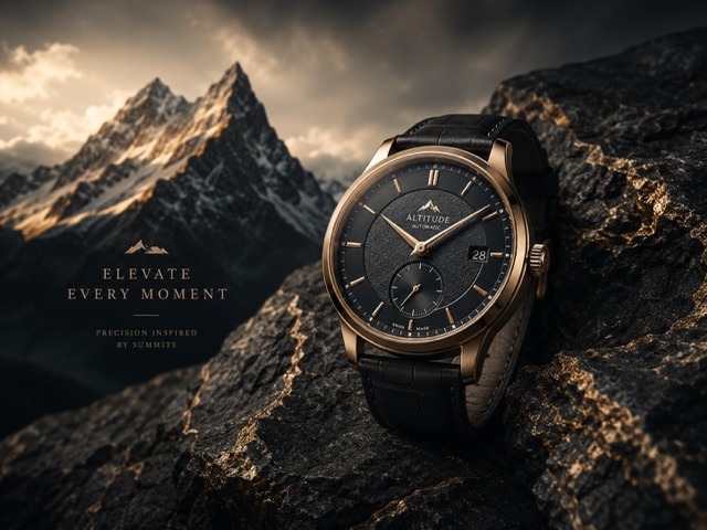
13. Summit Bronze Color Palette
HEX Codes: #12171A #30383D #B99355 #E5D7BB #F7F2E8
Mood: Luxurious, confident, sophisticated
Best for: Watches, premium products, hotels, luxury packaging
Summit Bronze pairs dark mountain rock with a muted metallic accent. Unlike bright yellow gold, bronze feels warmer and more natural.
Use black and charcoal as the dominant colors. Apply bronze only to thin lines, logos, product details, or important headings. Cream prevents the darker colors from becoming too heavy.
AI Image Prompt:
Luxury watch advertisement inspired by a mountain summit, premium watch placed on dark textured stone, dramatic studio lighting, color palette using #12171A, #30383D, #B99355, #E5D7BB, and #F7F2E8, subtle bronze reflections, elegant commercial photography, 4:3
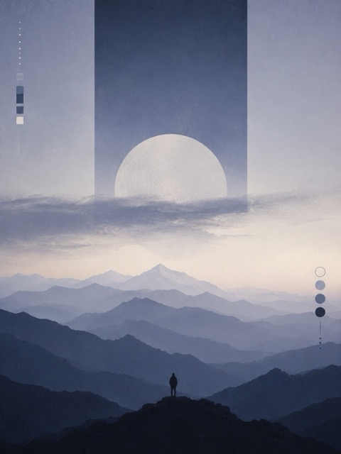
14. Blue Hour Ridge Color Palette
HEX Codes: #F3F1EB #A5ADC1 #64728F #35415E #202636
Mood: Contemplative, artistic, cinematic
Best for: Album artwork, film posters, cultural events
Blue Hour Ridge reflects the period after sunset when mountain outlines become dark and the remaining light turns blue. It feels emotional and cinematic without requiring bright colors.
Use dark blue across large areas, pale cream for important text, and the medium shades for layered mountain shapes or atmospheric gradients.
AI Image Prompt:
Atmospheric indie music poster inspired by mountain ridges during blue hour, abstract layered peaks, subtle film grain, color palette using #F3F1EB, #A5ADC1, #64728F, #35415E, and #202636, cinematic minimalist design, spacious typography area, 3:4
15. Birch and Linen Color Palette
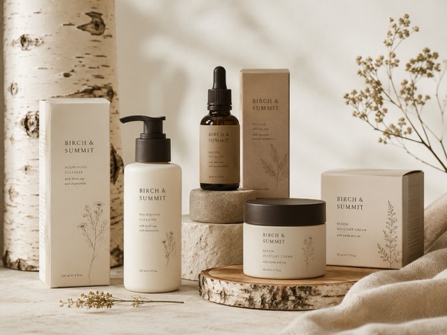
HEX Codes: #FBF8F1 #E7DAC7 #BCA789 #74634F #342D26
Mood: Warm, clean, natural
Best for: Skincare, home products, wellness packaging
Birch and Linen combines warm white, natural fiber, pale wood, and bark brown. It feels clean without looking clinical, making it suitable for products that emphasize comfort, simplicity, or natural ingredients.
Pair these shades with uncoated paper, linen fabric, ceramic objects, or subtle wood grain. Keep decorative elements simple.
AI Image Prompt:
Natural skincare packaging arranged in a clean studio, minimalist bottles and boxes with subtle botanical details, birch wood and linen textures, color palette using #FBF8F1, #E7DAC7, #BCA789, #74634F, and #342D26, soft daylight, premium product photography, 4:3
16. Glacial Current Color Palette
HEX Codes: #F6FAFC #C9E5EF #78B7CA #36748A #193E4D
Mood: Modern, capable, energetic
Best for: SaaS landing pages, technology brands, mobile applications
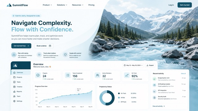
Glacial Current uses clean blue shades that feel active without becoming overly bright. It is especially effective for digital products that need to communicate clarity and forward movement.
Use white and pale blue as the foundation. Medium blue can serve as the primary button color, while deep teal is suitable for navigation, headings, and footer sections.
AI Image Prompt:
Modern SaaS landing page interface inspired by a glacial mountain river, clean hero section, product dashboard cards and simple icons, color palette using #F6FAFC, #C9E5EF, #78B7CA, #36748A, and #193E4D, polished professional UI, no device frame, 16:9
17. Midnight Glacier Color Palette
HEX Codes: #090E13 #152532 #294B5D #71A9C3 #E8F5FC
Mood: Dark, cold, futuristic
Best for: Film titles, game environments, dark-mode interfaces
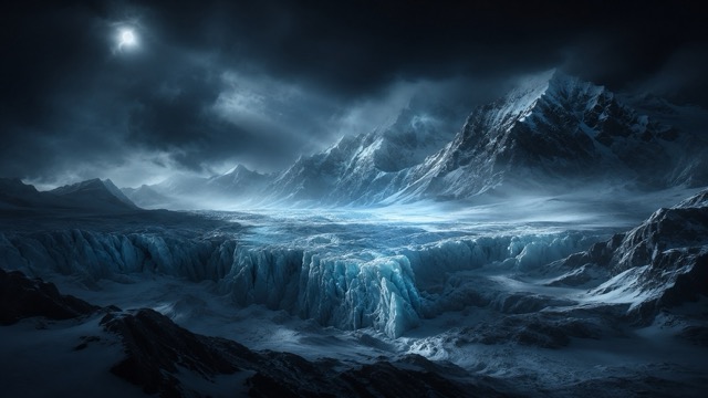
Midnight Glacier creates strong contrast between deep black-blue shadows and luminous ice. The lightest blue can be used for titles, borders, or reflections, while the darker shades create depth.
This palette works best when the composition remains simple. Too many decorative elements can compete with the dramatic light-to-dark contrast.
AI Image Prompt:
Cinematic frozen mountain landscape at night, enormous glacier beneath a dark sky, thin beams of cold light reflecting across the ice, color palette using #090E13, #152532, #294B5D, #71A9C3, and #E8F5FC, high contrast, atmospheric fog, realistic cinematic photography, 16:9
18. Golden Alpine Field Color Palette
HEX Codes: #FFF5DE #F5CE83 #C69B43 #71806A #304236
Mood: Sunny, earthy, inviting
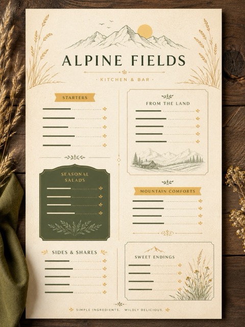
Best for: Restaurant menus, cafes, seasonal promotions
This mountain color palette combines warm sunlight, dry grass, weathered stone, and distant green slopes. It feels cheerful while maintaining a natural, rustic character.
Use warm cream as the main background. Deep green is suitable for prices and headings, while gold and amber can highlight categories, icons, or special offers.
AI Image Prompt:
Modern rustic restaurant menu inspired by a golden alpine field, clean organized sections, subtle mountain and grass line illustrations, color palette using #FFF5DE, #F5CE83, #C69B43, #71806A, and #304236, textured paper appearance, elegant readable typography, no food photos, 3:4
What Colors Pair Well with Mountain Tones?
Mountain colors usually work best with neutral shades that preserve a natural sense of space.
Snow White and Warm Cream
White, ivory, and cream help dark greens, browns, and slate colors remain readable. Warm off-white often feels more comfortable than pure white, especially when the palette includes earth tones.
Stone Gray and Charcoal
Gray creates structure and can be used for borders, cards, typography, or navigation. Charcoal is a softer alternative to pure black and works naturally with forest or glacier colors.
Bark Brown and Natural Beige
Brown and beige strengthen rustic or handmade aesthetics. These shades are useful for packaging, hospitality, coffee brands, and outdoor products.
Sunrise Orange and Amber
Warm accents make a cool mountain palette feel more energetic. Use terracotta, apricot, coral, or amber for buttons, labels, icons, and promotional details.
Glacier Blue and Teal
Blue and teal create a calm, refreshing appearance. They are especially useful for wellness, technology, environmental, and travel designs.
How to Use a Mountain Color Palette in Design
Start with a Light Background
Choose snow white, pale gray, cream, or misty blue for the main background. A light base makes the layout easier to read and gives darker mountain colors enough space.
Select a Dark Text Color
Deep charcoal, forest green, navy, or bark brown can replace pure black. This creates softer contrast while maintaining readability.
Give Each Color a Purpose
Avoid using every shade equally. A practical system might include:
- 60% light background color
- 25% supporting neutral or middle tone
- 10% dark structural color
- 5% accent color
The accent should guide attention toward buttons, prices, labels, or important messages.
Add Natural Texture Carefully
Paper grain, matte surfaces, wood, stone, fog, and subtle gradients can reinforce the mountain theme. Keep textures light enough that they do not interfere with text or product details.
Test the Palette in a Real Layout
A row of color swatches may look attractive but still fail in a real design. Test the palette on a poster, website, product package, social graphic, or presentation before finalizing it.
How to Create Mountain Palette Images with AI
AI image tools make it easier to test a mountain color palette before building an entire campaign.
Start by defining the type of visual you want to create, such as:
- Travel poster
- Website hero banner
- Coffee package
- Restaurant menu
- Album cover
- Mobile app interface
- Cinematic landscape
- Social media advertisement
Next, include all five HEX codes in your prompt. Clearly explain which colors should dominate and which color should appear only as an accent.
For example:
Create a cinematic mountain travel poster using #F6FAFC as the main background, #C9E5EF and #78B7CA for atmospheric mountain layers, #36748A for supporting elements, and #193E4D for typography and strong contrast. Minimal composition, realistic lighting, premium travel campaign aesthetic, 3:4.
You can browse the Pixomi Banana Prompts library to discover different composition, lighting, photography, illustration, and poster styles. After choosing a suitable prompt structure, replace its original colors with your preferred mountain palette and adjust the subject to match your project.
For more consistent results, change only one major element at a time. Keep the palette fixed while experimenting with the lighting, camera angle, visual style, or layout.
Mountain Color Palette FAQs
What is a mountain color palette?
A mountain color palette is a group of colors inspired by alpine landscapes, including snow white, granite gray, forest green, lake blue, bark brown, sunset orange, and shadowy navy.
How many colors should a mountain palette include?
Four to six colors are usually enough for most projects. A five-color palette provides room for a background, text color, supporting shades, and one accent.
Are mountain palettes suitable for website design?
Yes. Mountain palettes often include light neutrals, middle tones, and dark colors, making it easier to build clear visual hierarchy across backgrounds, cards, buttons, text, and navigation.
Which mountain colors are best for an outdoor brand?
Evergreen, slate gray, warm cream, bark brown, and muted orange create a dependable outdoor identity. Use green as the main brand color and orange as a controlled accent.
Which mountain palette works for a luxury brand?
Combine near-black, charcoal, muted bronze or gold, and warm cream. Keep metallic colors limited to logos, borders, and small highlights.
How can I prevent a mountain palette from looking dull?
Add one controlled warm or cool accent. Amber, terracotta, berry pink, ice blue, or teal can introduce energy while preserving the natural foundation.
Can mountain colors be used for social media content?
Yes. Brighter mountain palettes featuring sunset orange, alpine yellow, glacier blue, or wildflower colors can make social media graphics more noticeable while maintaining a cohesive natural style.
Final Thoughts
Mountain color palettes bring together the calmness of nature and the structure required for practical design. Whether you prefer misty blues, rugged forest greens, warm cabin browns, neutral stone shades, or dramatic sunset colors, mountain landscapes provide combinations for almost every creative direction.
Choose a palette that matches the emotion of your project, assign a purpose to every color, and test the combination in a real design. With clear HEX codes and detailed AI prompts, you can quickly turn mountain-inspired colors into posters, websites, packaging, advertisements, and original visual content.